
Challenge
Keep a premium, consistent look on the packaging, in the online shop and in promotion across a wide and growing range.
Case study · Goodvibe
For a large Swiss lifestyle online shop we designed packaging, product graphics and visuals for the website, newsletters and promotions. The result is one premium visual language that sets the brand apart on the shelf and online.
Keep a premium, consistent look on the packaging, in the online shop and in promotion across a wide and growing range.
One graphic system for packaging, web visuals, newsletters and promotional materials, built on clarity and Swiss precision.
The brand looks equally refined on the product, in the online shop and in campaigns, and its products are easy to recognise.
Goodvibe is a large Swiss online shop for lifestyle products and accessories. It has been on the market since 2016 and builds on a wide range, its own product lines, fast delivery and a personal approach to customers.
In e-commerce, trust decides. Customers often choose by the packaging and by how professional the brand looks online. Goodvibe needed visuals that feel premium while staying clear even with all the information a pack has to carry.
The same language had to work for the online shop, newsletters and promotional vouchers, so that every channel feels like part of one brand. And the whole system had to grow easily with new products.
We went through the range, the customers and the way Goodvibe sells online, to see where visuals matter most.
We chose a minimal, precise style with strong use of the logo that feels premium and reads well even at small sizes.
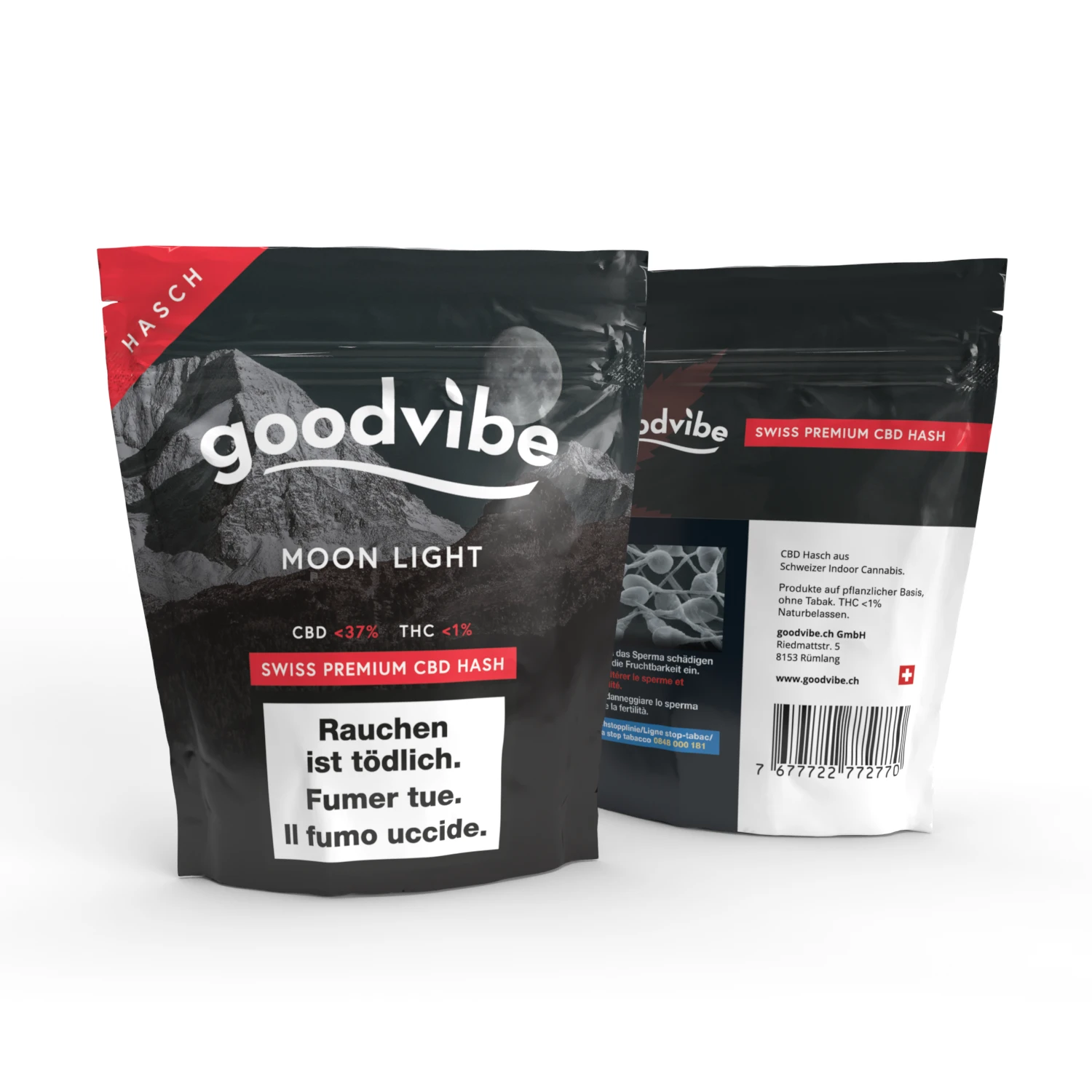
We designed a series of packs where every product has its own colours while the whole range shares one framework.
We carried the same language into graphics for the website, newsletters and promotional vouchers.
Each product got its own colours and mood, from dark, understated variants to bold, colourful ones. A shared layout, typography and logo position keep the whole range together, so customers recognise the brand at first glance. All the information on the pack has a fixed place and does not disrupt the design.
For customer communication we created newsletter graphics and content visuals, such as reports from trade fairs and events where the brand presents itself. The content is clear, easy to read and carries the same handwriting as the packaging.
Gift vouchers and promo banners combine strong photography with a clear offer and code. They work on the website, in emails and on social media.
For an online shop with a wide range, consistent design does more than look good. It builds trust and helps customers find their way. Today Goodvibe looks refined and confident wherever it meets its customers.
Tell us what you are working on. We reply within one business day.

