
Challenge
Set the doctor apart in a field where clients look for both trust and beauty, without feeling coldly clinical or too cosmetic.
Case study · MUDr. Jana Lukáčová
For MUDr. Jana Lukáčová we created a brand that combines feminine elegance with medical precision. From the JL initials and the colour palette to medical apparel and gift vouchers.
Set the doctor apart in a field where clients look for both trust and beauty, without feeling coldly clinical or too cosmetic.
A system of two logos, a JL monogram and a soft dusty rose palette that work in the clinic, on apparel and in print.
The brand feels luxurious and professional, matching the high standard of the treatments the clinic provides.
MUDr. Jana Lukáčová is an aesthetic medicine doctor. She focuses on professional skincare, aesthetic treatments and a personal approach to every client.
Aesthetic medicine sits between medicine and beauty. Clients choose a doctor they will trust with their face, and they decide based on expertise as well as the overall impression. The brand had to feel as credible as a medical practice and as elegant as a premium salon.
The identity also had to work in two forms: personally, with the doctor's title and name, and as the DR. LUKACAESTHETICS brand for communication and gift vouchers.
We defined the values the brand should carry: expertise, gentleness and a personal approach to every client.
We turned the initials J and L into a symbol of fine lines, complemented by a primary logo with the name and a secondary DR. LUKACAESTHETICS logo.
A dusty rose palette and airy type give the brand calm and elegance while keeping it clean and professional.
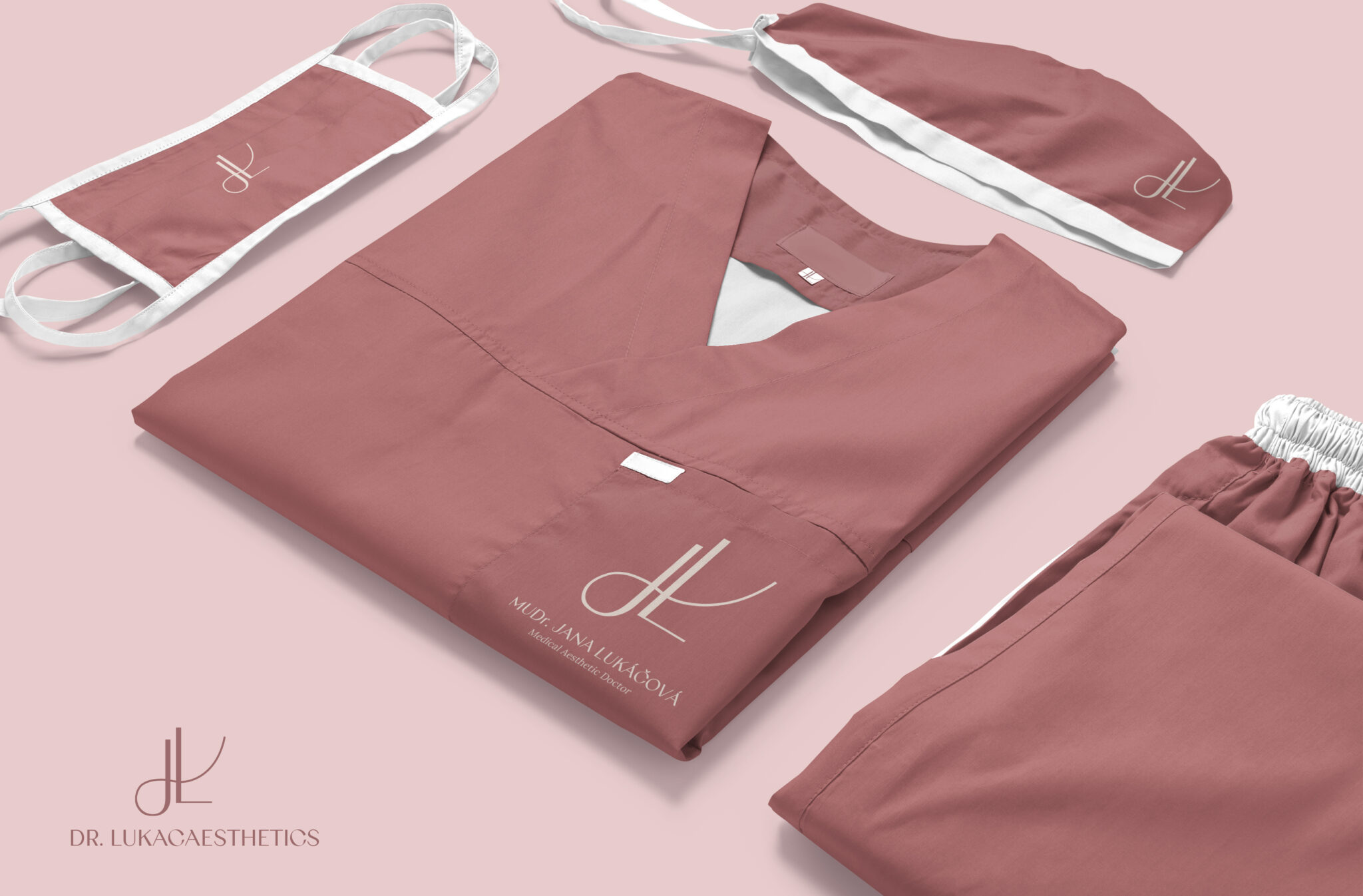
We applied the identity to medical apparel, masks and caps, and designed gift vouchers.
The primary logo carries the doctor's name and title, while the secondary DR. LUKACAESTHETICS logo serves communication and sales. The JL symbol works on its own or inside an oval frame, for example as embroidery or on social media.
A palette of dusty rose and warm tones, paired with airy typography, creates a calm, feminine and premium feel. The visuals carry the same mood, focusing on natural, healthy skin.
Gift vouchers designed as an elegant card extend the brand into sales. The JL symbol also appears on medical apparel, masks and caps, so the impression stays consistent from the first contact to the treatment itself.
A good healthcare brand does not need to shout. It needs to reassure, build trust and feel as caring as the treatment itself.
Tell us what you are working on. We reply within one business day.

